My Dog’s Favorite™
Brand Identity · Packaging Design
My Dog’s Favorite™ is a brand of dog food products by Oscar & Banks. The brand new company wanted a modern, eye-catching design that would help to market their dog food sauce brand that would be launching in 2018.
As the lead designer on the project, I was tasked with coming up with a unique and modern brand identity for the company that would appeal to a wide range of dog owners. I compared the design of many major dog food brands to get an idea of what worked well and what was falling short in the current market. I saw some brands that excelled in their designs and others who felt dated and didn’t appeal to younger design-savvy audiences. With the excelling brands, I examined what areas could be improved in their designs and made a plan for a competitive brand identity.
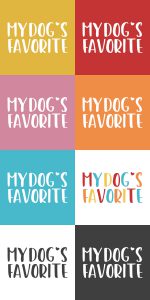 Designing an Adaptive Logo
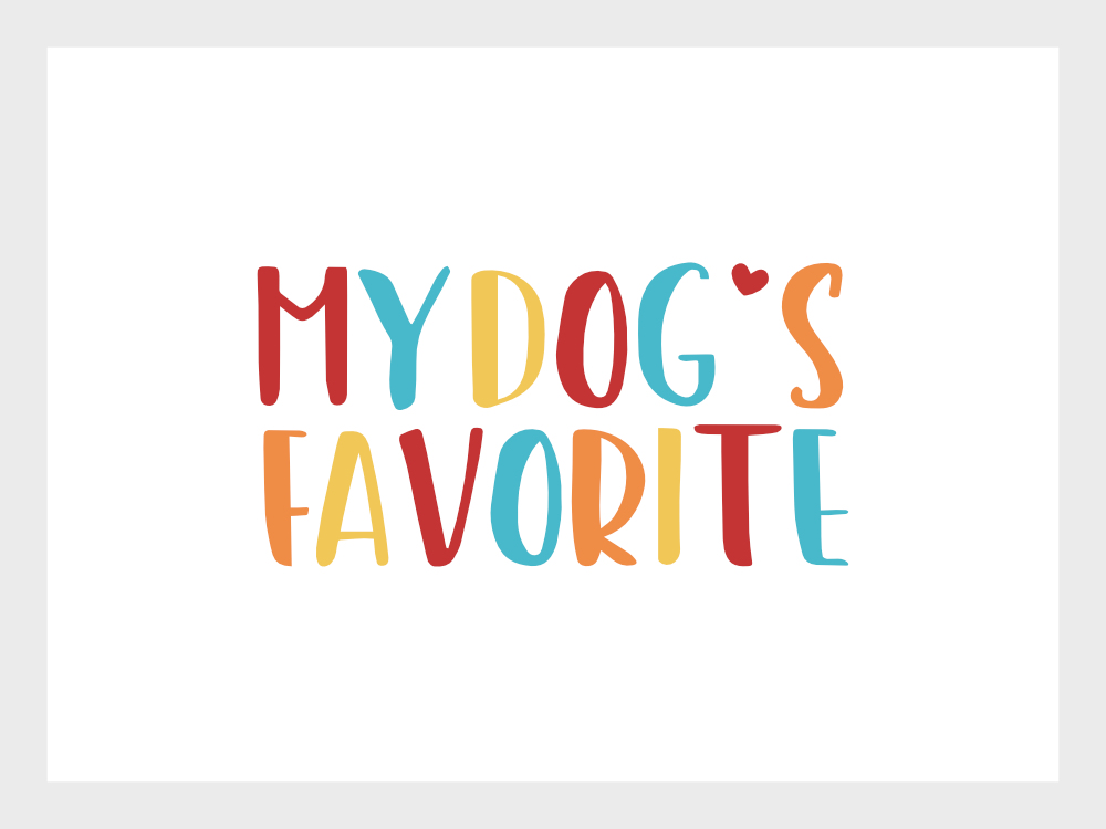
The My Dog’s Favorite logo was to be kept simple yet fun, so that it could be used in a wide range of products. The logo would need to work well with many different products, as well as many different flavor varieties of each product. I wanted to keep a lot of symbolism out of the main logo so it could be used for any dog food product the company makes in the future. I chose a very simplistic, handwritten font, then added in a small heart to emphasize the “favorite” part of the brand name.
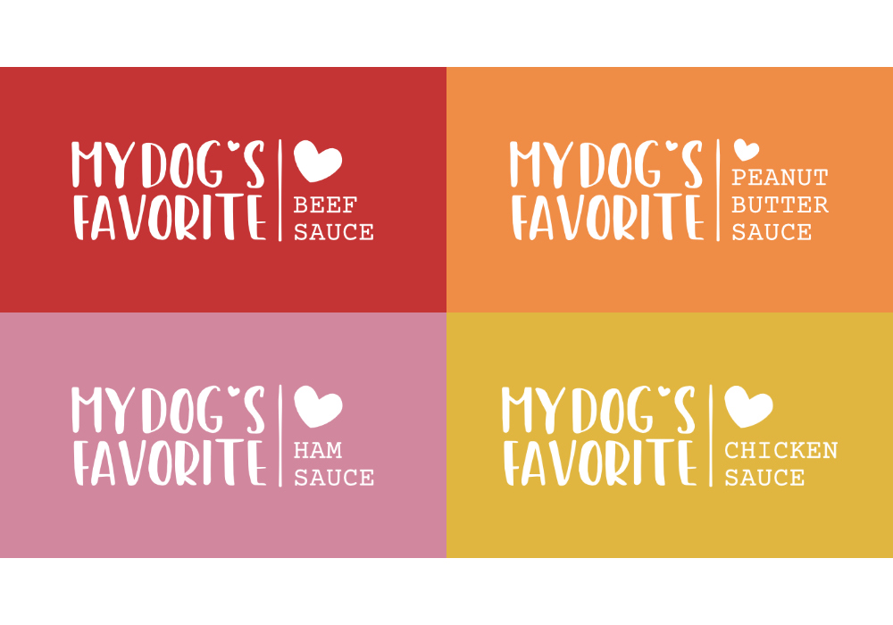
The logo can be used as either all white, all black, or a full color version that incorporates all of the colors used in their first line of dog food products. I also created variations of the logo specifically for the dog food sauce the company was hoping to launch with.
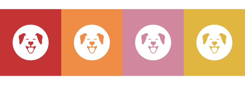
The client wanted to also have something that signified right away that their products were for dogs. To meet this need, I created a simple dog icon that could be used like a branding “badge” on marketing materials for the products. The icon shows a minimalistic face of a dog, with a heart for the nose. This emphasized the idea of the “Favorite” part of the product name. This icon is seen on the packaging design concept I created for the company, and was intended to be used in more places – like on the website, business cards, and more.
Creative & Modern Packaging
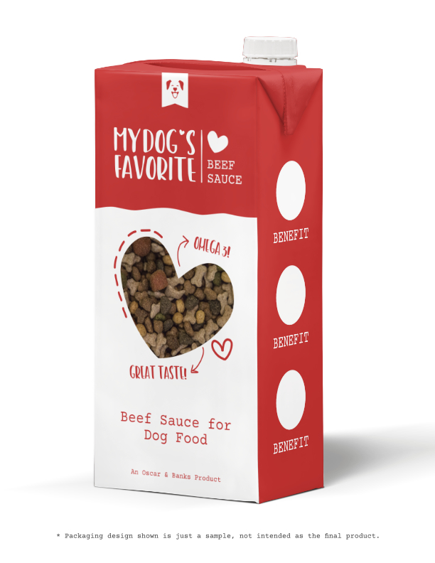
The first product the company wanted to release was a line of sauces for adding to dry dog food. The packaging for this product had to hold a liquid and be resealable for multiple uses. We decided on aseptic cartons with a screw on cap from Terta Pak.
The initial line of dog food sauces would contain 4 flavors. Using the simplistic logo I created, we moved on to creating unique packaging color schemes for each individual flavor. The colors were chosen to correlate to the flavors, while still looking great when shown all together. This allowed for expansion if other flavors were introduced into the product line at a later date.
