Fee-Only Network
Logo Design · Custom WordPress Theme Design · Ongoing Graphic Design
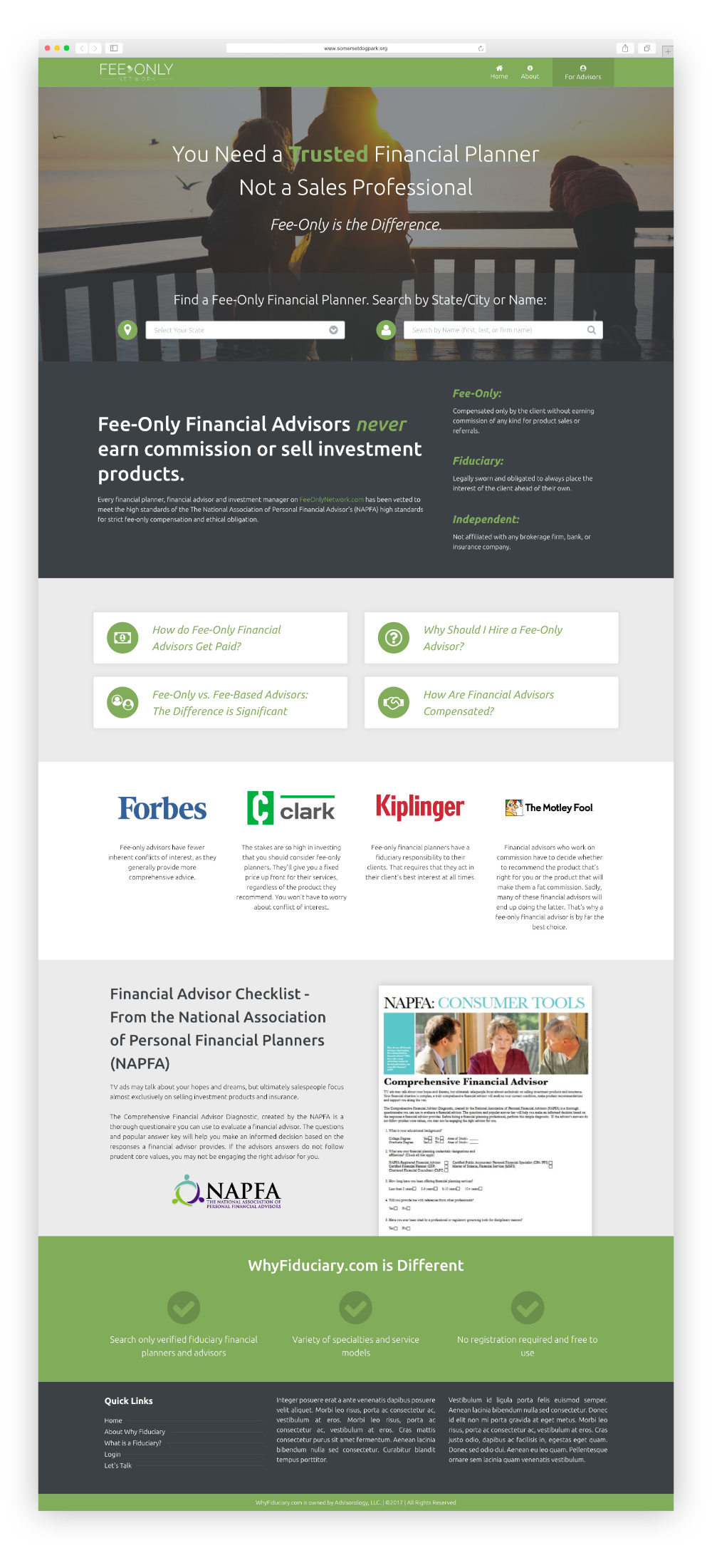
Fee-Only Network is an online directory for finding financial planners in the US who work on a fee-only basis. This directory is endorsed by many notable names in the financial industry, including the National Association of Personal Financial Advisors (NAPFA). Users can come to the Fee-Only site to search through advisors in their area that work in the financial areas they need.
I’ve been working with the Fee-Only Network team for over 2 years to rebrand and create modern designs for a variety of graphic projects within the company. Fee-Only Network contracts Thought Space Designs with myself as the lead graphic designer and creative consult. I’ve worked with the company to improve UX/UI of the website, as well as a full rebrand of the logo and website.
Focus on the User
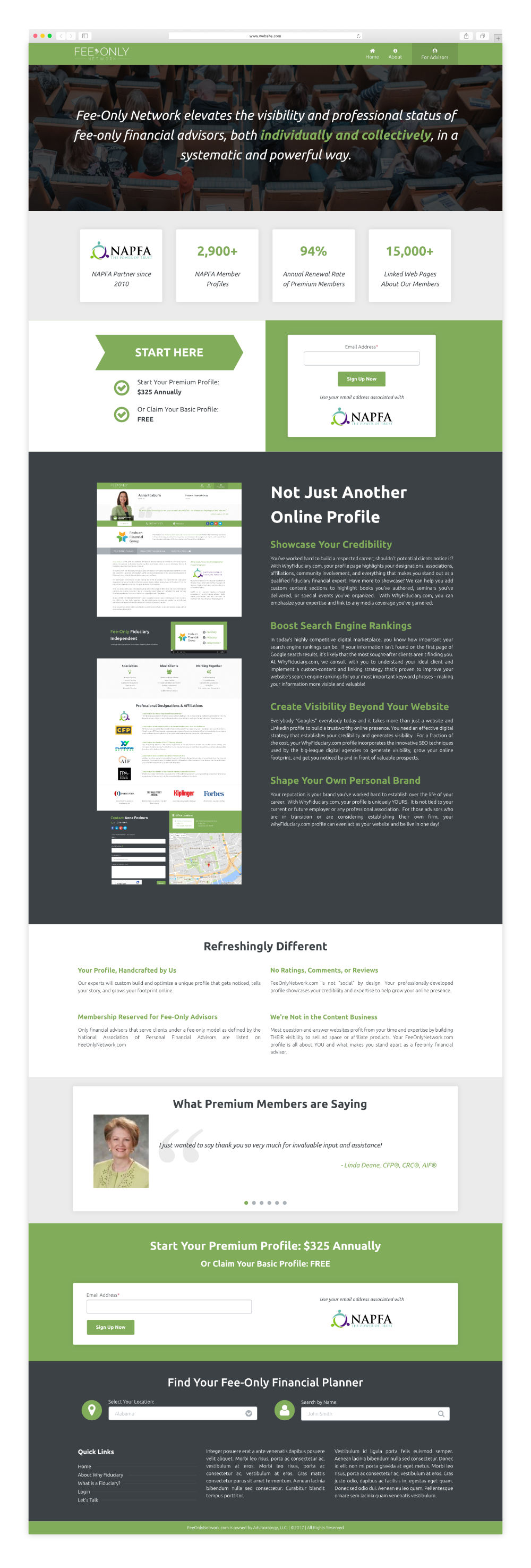
The most important part of the Fee-Only Network website is the profiles for the advisors. The profiles must include a very wide range of information that clients will be looking for when choosing a financial advisor. I was tasked with taking this long list of data and laying it out in a presentational and useful way. With input from Fee-Only’s team, I organized the information so that what was most important could be found quickly and easily.
The profile data had to be adaptable to advisors who would have different information for the same sections. Information like financial firm logo and description, videos, skills and specialties, professional designations, and contact information all had to be laid out in a way that could accommodate different amounts of information for each individual advisor. Some sections needed to be hidden if the advisor chose not to fill in that information, so the design of the page had to be flexible enough to look good even if those sections weren’t present.
Rebranding for the Future
The old Fee-Only Network logo was outdated and didn’t help to portray the company’s professional and exclusive database of vetted financial advisors. The Fee-Only team wanted something that would look modern and truly represent their tagline of “Fee-Only Network is the Difference” in choosing a financial advisor.
We worked through an extensive concept development process where a wide range of ideas were tested for the new Fee-Only Network logo. The original idea was to incorporate a key symbol into the logo as a way of illustrating the trust and security of selecting a fee-only financial advisor. After a few concepts of key logos, we explored the idea of incorporating a shield symbol to further enforce the idea of safety and security.
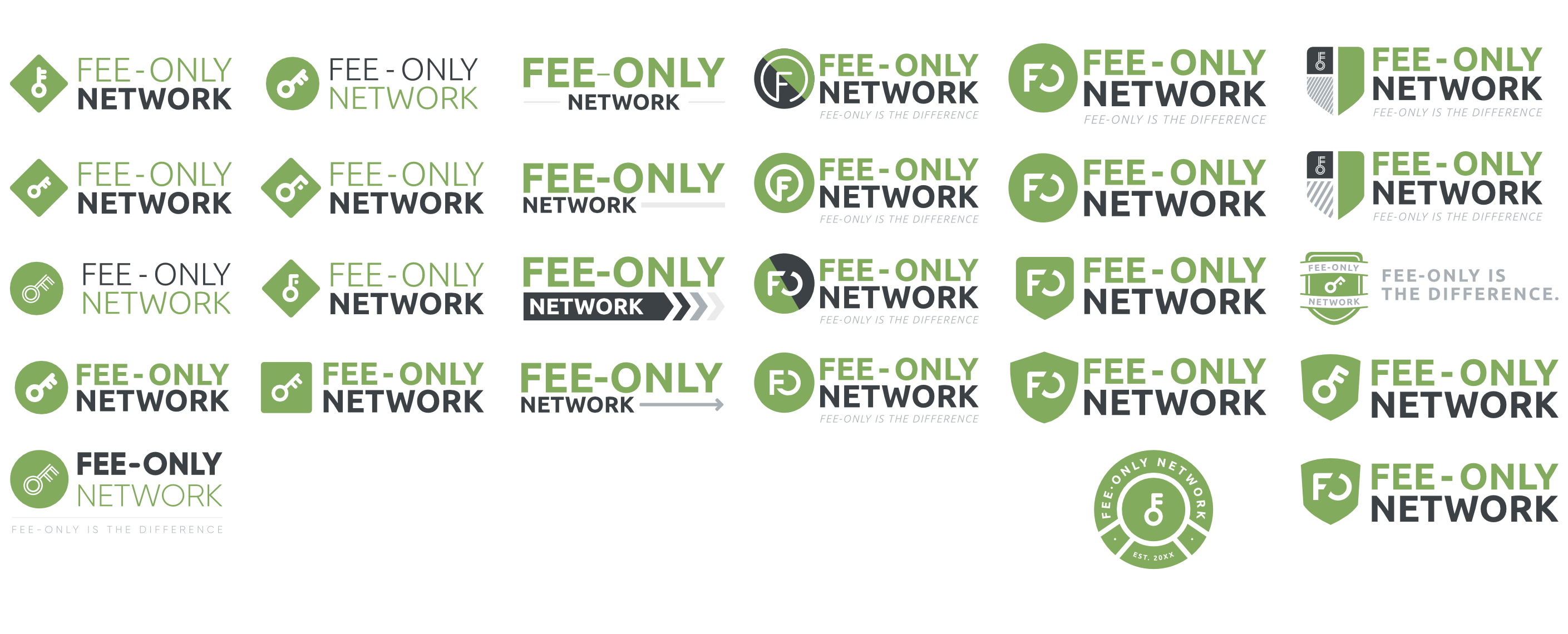
With each new round of concepts, the logo slowly evolved into something more simplistic and text based. We finally settled on a mostly text based logo with a subtle icon in order to keep the brand looking professional and clean. A small chevron pointing to the right illustrated the idea of forward progression – something that is ideal for anyone looking to hire a financial advisor. This more simplistic logo also allowed more variation in the design of the website itself.

The client was very pleased with the simplistic and clean look of the final logo concept and we decided to move forward with the idea on the redesign of the website.
The Brand Was Just the Beginning
I’ve worked on a number of other small graphic design projects for Fee-Only Network that have helped to enforce the new branding for the site. Small projects have included trade show booth signage, business cards, brochures, and email templates created for their MailChimp campaigns.
In January of 2018, I worked with the FON team on a few marketing materials that would be used to promote the new brand at trade shows throughout year. One of the most interesting projects I got to work on was stickers that would be placed on bananas and handed out at the trade shows. The client expressed that the bananas would be a unique trade show item that catches the attention of anyone passing his booth. To make the project more effective, I researched reusable stickers. The concept would allow patrons to take the sticker off the banana and place it on something else – such as a laptop, vehicle, or notebook. This takes the advertising beyond the booth and into the hands of Fee-Only’s customers.